fubiz
LOGO ANIMATIONS
THE PROJECT
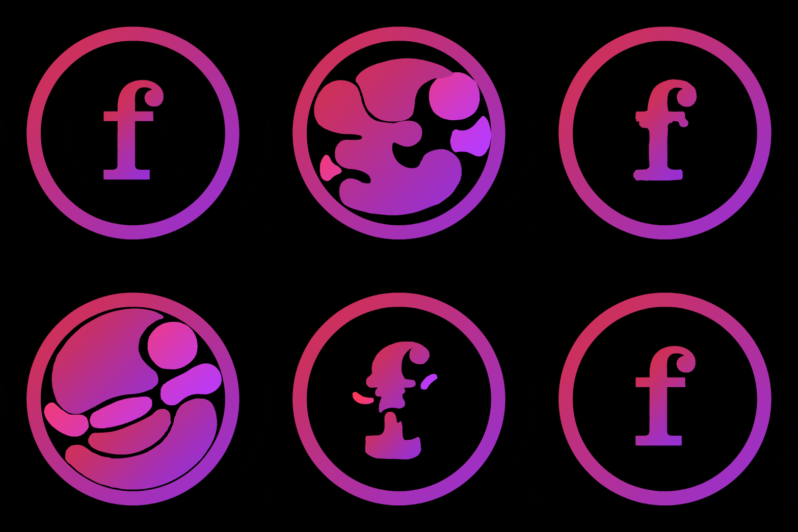
For its 10th anniversary, Fubiz Media has entirely reworked the new version of its website to make reading and browsing more enjoyable. The content becomes interactive with animated elements every time it loads. The logo in letters - at the top of the navigation - becomes animated according to the current category of articles.
I worked on the general abstract categories of the website and created a bunch of 2D handmade logo animations.
Art direction, storyboarding & 2D animations: Thomas CHARIER
Project realized within the Mattrunks Studio.
Client: Fubiz
~ 2015
letters × hand-drawn animation
Logo animation is a common practice in brand identity and webdesign. Useful on all digital media, it takes its meaning when it is used to understand the logo and the services offered. This animation always has its own theme. It also includes related elements such as the loader, introductions and TV visual identity.
Fubiz Media is a news discovery platform covering all areas of design applications. Graphic design, architecture, object design, photography, video and new technologies. Above all, it is the pursuit of aesthetics and innovation. An exhibition of the best work by artists, agencies and brands.
This source of inspiration plays an important role on the French and international design scene. The agency, Fubiz studio, does not only focus on the blog. Every year, it organizes the fubiz conferences and sets up the collaboration of artists, personalities and famous design actors.
“your daily dose of inspiration.”
The editorial line of fubiz media is to highlight the originality and creativity of the works. Graphics, design and video are generally illustrated with figurative icons. They leave no room for interpretation.
The fields of design are so vast that it is inappropriate to confine a category to a stereotypical icon. The abstraction of animations allows a free, wider use, while preserving a unique identity.
The graphic system is organized around a loop system that always brings back the fubiz identity. The fluid animations symbolize the cultural flow, the complexity and the ephemeral nature of creative thinking.
As a global identity work, we animated the logo but also the website loaders that appear when the page content is loading. 3 dynamic loading concepts in the same spirit as the logotype.
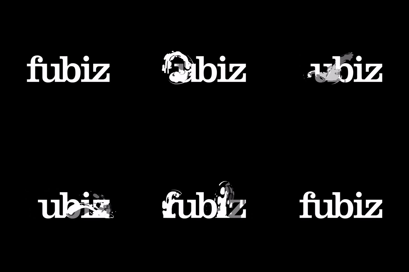
The animation transforms the letters into an abstract concept and finally comes back to the original logo, the final idea.
The rectangular format of the media and its small size can make it difficult to read the information. The silhouette of the animation and the simplification of the shapes provide an easy graphic solution to this problem.
The original logo is plain white. We limited colors to 3 shades of gray for depth management. It makes the animation readable on all supports and backgrounds, in all sizes, and remains available in all colors.
The letters disappear, as a whole block or individually, to make way for geometric or organic shapes. These shapes come to life around the remaining letters, causing collisions and the juxtaposition of flat surfaces.
The movement dissipates and triggers the sudden appearance of the missing letters. The velocity is preserved from start to the end making the transitions natural and fluid. Result is a dynamic, elegant and a timeless animation design.
“simple but elegant.”
All animations are hand-made, frame by frame. This method makes it possible to animate fluids and optical illusions with a unique artistic direction.
technical breakdown
The action's cut-out was inspired by the concept of pose to pose. This technique is an important part of the conception of a traditional animation.
Key moments are drawn and an interval of images is assigned to them. The timing is thought out in advance, which limits the scope of movements in a given period. Each animation is based on the same loop principle and timing. The original logo is partially or completely transformed and then returns to its original shape.
The vectorial workflow allows to preserve details for format variations and to keep the original logo unchanged.
conclusion
This concept of animation came to me in the middle of a brainstorming session over a cup of coffee. The observation of fluid dynamics and the symbolism of coffee in the designer's routine led to this idea of blending style.
A handmade animation is more enjoyable and transforms a cold branded logo into a playful identity. I always say that people empathize more with traditional animation because of the skills it involves.
Thanks to my 2D animation skills, I can express the hand-made touch of the designer and give more life to a classic and boring typographic logotype.
The abstraction of our environment triggers creative reactions that only seek to be exploited, like my cup of coffee!


